top of page
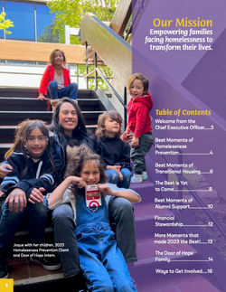
 01.Mother and son portrait session I photographed for Door of Hope’s Annual Report and Homelessness Prevention Program, capturing their renewed sense of hope and optimism as they step into a future no longer defined by the fear of homelessness. |  02.I prefer to abandon portrait studios for abandoned zoos —because sometimes, the fiercest animal isn’t the one behind the bars. |  03.Gala photography should feel less like formal networking and more like the warmth of a family reunion—people united by a shared vision. |  04.Eniola and Olumide’s Nigerian engagement shoot. Her eyes held a world of wonder, and I was determined to capture every bit of the love and light within them. |  05.Sample spread combining my portrait session with Jaque’s family and the layout design for Door of Hope’s annual report — photographed in a candid, lived-in way to reflect the authenticity of a mother and her five kids in their everyday rhythm. |
|---|---|---|---|---|
 06.Sample spread from Door of Hope’s Quarterly Report. Some images presented challenges — a child waving a toy weapon, a girl with her Zoom camera off, a couple with distracting background elements, and a table scene with too much empty space. This spread shows how I worked creatively with the available photos to maintain a cohesive, polished layout. |  07.A sample spread from Door of Hope's Quarterly Report. When laying out a variety of complex information, I like to include a large image to give the eyes a visual treat. |  08.Spread from Door of Hope’s Quarterly Report. I’m most proud of the father-and-sons photo — originally low-light and grainy — which I brought to life through careful photo editing and AI enhancement. |  09.Building on Door of Hope’s recognizable house icon and brand palette, I developed a clean logo for their Spring campaign that visually reinforces DOH as a solution to homelessness, and the falling hardships could instead be the fence to your new home. |  10.Following Door of Hope’s brand guidelines, I created a minimalist logo for their Spring campaign, Empowerment Through Employment. Centering the design on the letter ‘E,’ the mark uses a ripple effect to visualize how empowerment — and employment — radiate outward and create impact. |
 11.The client requested two logo concepts with an ironic twist, while keeping the style playful and cutesy. Option one. |  12.The client requested two logo concepts with an ironic twist, while keeping the style playful and cutesy. Option two. |  13.From a capital campaign slide deck—an example of my approach to keep information bold and quick to read. |  14.From a capital campaign slide deck—an example of my approach to keeping images bold and simple, avoiding the clutter of multiple sentences. |  15.From a capital campaign slide deck—an example of my approach to keeping images bold and simple, avoiding the clutter of multiple sentences. |
 16.An example of a brochure using Door of Hope branding guidelines. |  17.A collection of hand-drawn scrollwork, reimagined with a botanical glow using Procreate on the iPad. |  18.A collection of hand-drawn scrollwork, reimagined with a botanical glow using Procreate on the iPad. |  19.A collection of hand-drawn scrollwork, reimagined with a botanical glow using Procreate on the iPad. |  20.A collection of hand-drawn scrollwork, reimagined with a botanical glow using Procreate on the iPad. |
 21.A series of abstract microscopic anatomy studies, created with watercolor, ink, and graphic elements. |  22.A series of abstract microscopic anatomy studies, created with watercolor, ink, and graphic elements. |
bottom of page